FITTED
Find a daily challenge, routine, and guidance to a healthy active life.
Fitted is a web app that is designed to encourage people who want to get into an easy routine for physical activities. The focus of this project was UI Design.
UX/UI Design
Solution User stories
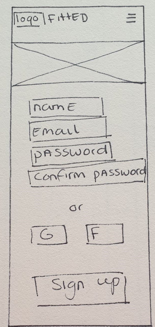
Derived from the user stories I was able to create a user flow to then start with Low-Fidelity wireframes and go in-depth on UI elements.
As a frequent user, I want to be able to earn achievements or rewards, so that I can stay motivated.
As a frequent user, I want to track progression and record what I’ve done, so that I can see my progress over time.
As a frequent user, I want to complete daily challenges, so that I can have an additional way to stay motivated.
As a frequent user, I want to be able to share routines with my friends who may also be interested, so that I can encourage them to become healthier.
Low-Fidelity
Mid-Fidelity
Visual hierarchy & Spacing
Steps such as determining visual hierarchy were important in the design process as they helped to determine the lay-out of the web pages. Next to this, grids were used to create visually appealing spacing between elements. Overall the web app should look clean, modern, and fun for the user.
Visual design principles
The app should motivate its users and evoke the feeling of passion when working out. The user should feel satisfied that she/he has find the time in their busy schedule to workout.
The mood board focusses more on the vulnerable side of working on yourself through the app. The rounded shapes in a soft texture represent a feeling of being open and vulnerable. The color scheme consists of bright orange with natural shades of green/brown.
Mood board
Rationale color
Using the mood board as inspiration and doing research to create a good color pallet, the accent color became orange. The color orange is commonly used with workout apps as they evoke emotions such as playfulness, warmth, and energy. Next to this, the vulnerable side of the user is portrayed by the use of green/brown tones. This way the web app has the perfect balance between being reliable and fun/quirky at the same time.
Style guide
The overall style of the web app should reflect the user persona and its goals.
Breakpoints
IPad
Desktop
Mobile


